Top drawer is always a great source of inspiration and I often try to get to the twice yearly events to get a feel for design trends and new colour palettes. I use this inspiration for Cheeky Leopard, but also for my design work at Makower UK. It's great to see everything (from luxurious bedding to the latest in plate designs) all under one roof. Top Drawer is held at Kensington Olympia, an immense space filled with goodies, so a few hours is the least time needed to see everything properly. I trotted off there yesterday and met up with my friend Bernie once there. She has a clinic where she does amazing treatments such as massage and facial, but she also sells beautiful items such as scented room sprays and designer jewellery and, of course, Cheeky Leopard bags! We had some fun rummaging through some beautiful jewellery pieces, looking for new designers to sell through her clinic. It was great to look at items I wouldn't normally look at and help choose a collection with her.
We also went our separate ways and I got to see some of the home decor trends as well as new card designs which were all very inspiring.
A recurring colour combination that stuck out for me was navy blue, coral and blush pink. I thought it worked so well in the bedding above, and in the trays below.
These trays were fab and shiny.
I love the colour of these deckchairs - navy blue and orange. Mix in some contrasting cushions, one cream and one with a blue and orange stripe.
What a fab selection of printed cushions!
I love the soft chalky colour palette of the bowls above. The yellow and green are strong and the blush pink just softens it nicely.
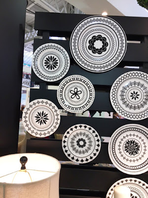
Geometric black and whites are always a favourite of mine and they look stunning on these plates which are too nice to eat off!
The nautical theme is always popular and something we do a lot of at Makower. We are always on the look-out for a new take on nautical. There were two very different themes that I saw at Top Drawer. The one above is more sophisticated and uses traditional images of coral and shells, but brings it up to date with a cool indigo palette.
The nautical theme above is more fun and graphic. I love the use of teals and blues.
I thought the mood board above was very clever, showing how the nautical theme can work through out the home - on tea towels, mugs and even a door mat!
Rice is a company that always has a vibrant stand selling their signature bright and fun home wares as well as items for children. I loved the patterned animal heads above.
These animal silhouettes look funky, placed on patterned grounds and check out the three fun coloured paper light shades in varying sizes.
The beakers above are nice and bright and I love the fresh foulard designs they have used.


No comments:
Post a Comment